Creative Direction
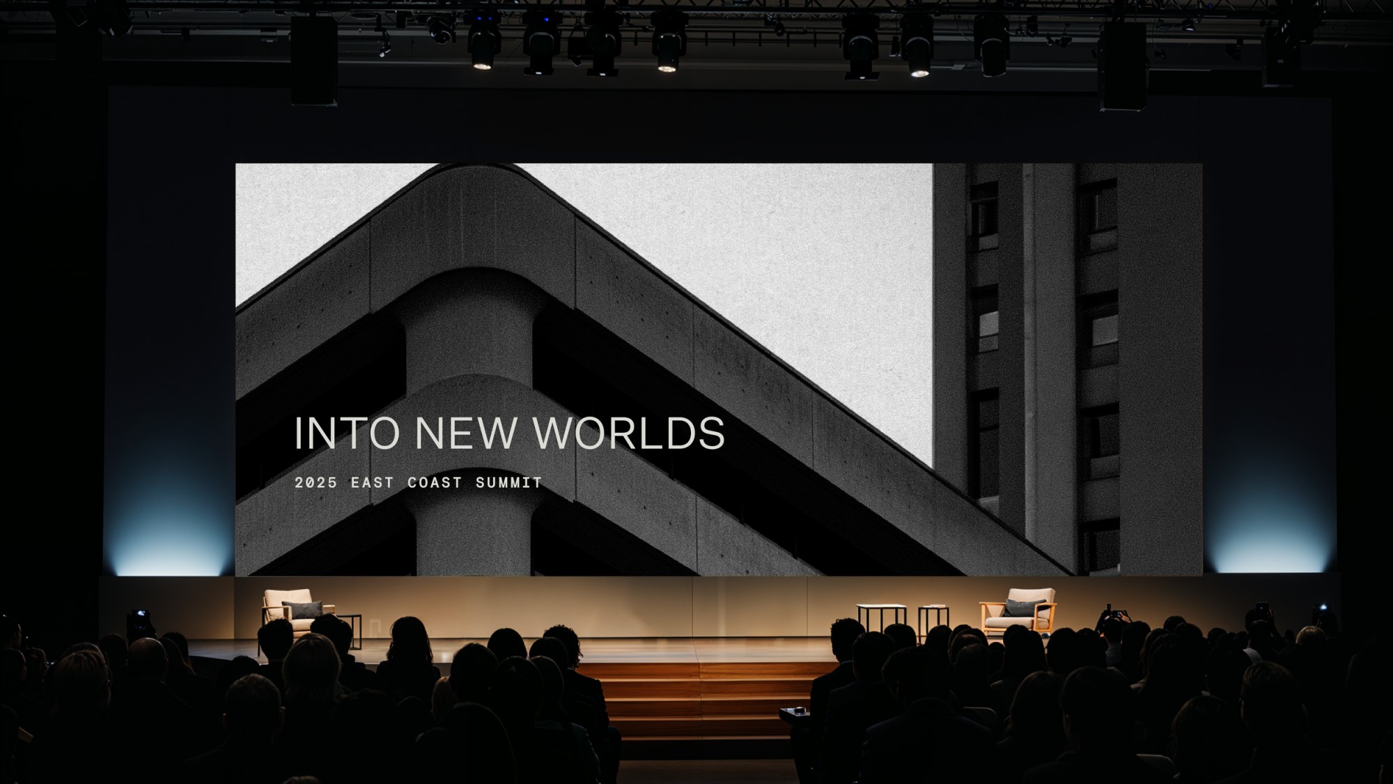
For Vault Equities, we developed a modern identity rooted in architectural precision and growth. The mark combines the “V” and “E” into a single ascending form—referencing both structural foundations and upward motion. The resulting system is minimal yet dimensional, designed to scale from investor communications to digital environments. Clean typography, restrained contrast, and geometric rhythm reflect the firm’s disciplined approach to equity development and long-term value creation. Vault Equities operates in the language of infrastructure — where ambition meets material.
The visual world we built extends beyond real estate into the architecture of possibility: concrete, steel, and horizon lines. A brutalist meditation on development as a form of authorship.